510-640-0151

510-367-8869

Contacts

92 Bowery St., New York, NY 10013

+1 800 123 456 789

annual reports service
Printing Guides

Annual Reports Service

A Top Annual Reports Service can be quite the cherry on the cake at the end of the year for a business.

An annual report is a financial and managerial document which is published by many corporations and other organizations to provide information on the activities of the entity, including its income and expenditure for the previous year.

The word ‘annual’ in this context means ‘for a full year’. Annual reports often include:

-A letter from the CEO or president, who talks about what’s been done over the past year and sets out what he or she sees as key challenges for the future.

-A summary of business performance against targets set out in corporate strategy, such as revenue growth, market share, product launches.

-Financial statements that show profit before interest and tax (PBIT) for each financial period, plus earnings per share.

Content for your annual report prints

In order to produce a great annual report, here are the core topics and strategies you must understand and take to the print shop with you:

  • How to create an annual report for your business?
  • What information should be included in an annual report?
  • The benefits of creating and publishing an annual report
  • How to use your annual report to improve your business

annual reports service

-A summary of business performance against targets set out in corporate strategy, such as revenue growth, market share, product launches.

– Financial statements that show profit before interest and tax (PBIT) for each financial period, plus earnings per share.

How to create an annual report for your business?

In order to create an annual report for your business, you need the following information:

– The reporting structure (business reporting structure such as parent, subsidiary and branch).

– Financial data (financial statements such as income statement, balance sheet and cash flow)

Financial Statements:

In order to produce a great annual report financial statements are divided into three categories: Income Statement, Balance Sheet and Cash Flow.

The first step of reporting is to turn your accounting information into financial reports that you can present in the annual report.

Your accountant should be able to provide this for you – or if not, an online tool like Xero can convert your transactional data into engaging reports that tell the story of your business’ performance over time.

What information should be included in an annual report?

Make sure to include at a minimum, the following information in an annual report:

–  A statement of financial performance (income statement)

–  A balance sheet showing the assets, liabilities and owners’ equity for a specific date

–  A cash flow statement that shows cash flows from operating, investing and financing activities including beginning and ending balances.

The benefits of creating and publishing an annual report

There are many benefits in creating and publishing an annual report:

– Helps you identify your strengths with basic analytics: reviewing past trends or benchmarks to set future targets.

It allows you to communicate these results in a way that is both authentic and impactful.

– Consistent messaging across all customer touch points provides a brand storybook with consistent themes for each audience throughout the year.

This helps employees and customers gain clarity on your mission.

– Ability to communicate your company’s value proposition, differentiate yourself from competitors and highlight your organization’s competitive advantage.

How to use your annual report to improve your business:

Annual reports should be used as a platform for change within the company. If you can show that you are responsive to shareholder needs then this will greatly impact their likelihood of supporting you in future projects or initiatives.

Being able to show what updates have been made based upon feedback from stakeholders is a great way of showing how well the company listens and responds to its audience.

Your next steps could include: publishing an annual report template, creating a narrative around the stories contained within it, communicating with shareholders both internal and external as well as distributing the report for feedback and to all shareholders.

The first step is creating a narrative:

-When writing your annual report, it can be helpful to think of your audience and what specific information they would like to see in the annual report.

For example, if the company’s values are safety and integrity, then these two concepts should appear throughout the annual report.

Ensure that you clearly communicate your mission statement so that employees and shareholders know exactly where you stand as a company.

-Make sure that any policies referred to within the annual report are either located within other materials or linked to those items (social media pages)

-You also should include contact information for questions or concerns about any of the content published: this should include a person’s first and last name, company email address as well as a phone number.

-When it comes to visuals (graphics such as logos or pictures), keep them simple with past images reflecting the quality of work that you do.

-If your annual report is more than ten pages long then consider including an executive summary to give readers an overview of your report.

How to choose the right words:

Achieving a tone and voice for your brand and messaging is important when it comes to creating the annual report: this allows each audience member to understand how information should be interpreted whether they are employees or shareholders.  

For example, if you run a tech startup using industry specific jargon might not make sense for your shareholders, so it is important to keep the language simple and clear with a focus on prioritizing your key messages.

If the message you are trying to communicate is funny or emotional then using humor might be an effective way of getting your point across.

In this same way, if there have been challenges that have shaped the organization then being transparent with this information might provide readers with a sense of humanness from internal or external stakeholders. 

Taking a storytelling approach in which you tell a narrative in a chronological order can help make complex ideas easier for all readers to understand.

This means doing proper research and preparation when creating content for annual reports by asking yourself:  

  • Who is my audience?
  • What information do they need in order to make informed decisions?
  • What emotions do I want to elicit from my stakeholders?
  • How can I share complicated information in a way that is easy for them to understand?

Remember, every annual report should focus on two key points:

-The impact of your organization’s work.  

-Your future plans and initiatives

It’s critical to remember that, while it may appear to be easier said than done, writing an annual report is not merely a matter of completing one! It’s likely to come across if this is the case.

Always ask yourself these questions when writing material that extols the value your organization provides to its investors or society as a whole.

Request a Quote & Strategy Session For Your Annual Report Here!
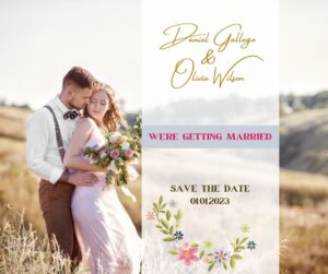
wedding printing
Printing Guides

Wedding Printing Guide & Essentials

Guide to Wedding Printing Essentials

Planning a Wedding? Learn about the best printing materials for successful wedding in our comprehensive guide.

What printing products are needed in a wedding?

The printing needs of wedding are primarily based on the type of printer you have. With our guide to wedding printing essentials, you will be able to select appropriate materials for your purposes. Listed below are common products used in weddings:

– Places Cards/Favor Tags

– Menu Cards

– Cake Topper Tiles/Cake Topper Signage

– Thank You Cards

-Table Number Posters / Table Plan Posters

-Guest Book Quotes & Advice Pages / Guest Signage / Guest Book Banner

What paper stock should I consider?  

Wedding invitations are generally printed on paper stock that has a finish between matte and gloss. The weight of paper stock varies depending on the type of printer you have.

Paper options include:

wedding printing

Premium Matte Paper  / German Etching

Benefits of Premium Matte Paper:

-Looks and feels like a real photograph

-Creates bold and dramatic visuals

-Durable and water resistant

Drawbacks of Premium Matte Paper:

-Textured finish reduces readability – writing can feel rough to the touch 

Wood Veneer  / Pearlescent Foil-Coated Paper

Benefits of Wood Veneer Paper:

-Looks similar to actual wood veneer

-Creates an elegant, polished appearance

Drawbacks of Wood Veneer Paper:

-Quality can vary depending on supplier and country of origin. More expensive than other paper options.  

Pearlized Paper / Ultra Metallic Sheets

Benefits of Pearlized Paper / Ultra Metallic Sheets:

-Create a shimmering effect to your prints

-Also available in sheets

Drawbacks of Pearlized Paper / Ultra Metallic Sheets:

-Premium foil stock can be expensive compared to other options.  

Silk Lamination

Benefits of Silk Lamination:

-Protective coating

Drawbacks of Silk Lamination:

-Can add significant cost

-Film is not transparent, so it can alter your image colors when applied

What finishing products are required?  

When planning a wedding, it is important to consider all of the different printing and finishing materials that will be used such as: envelope addressing, envelope inserts, postage stamps, envelopes and self-mailers.

What paper goods do you need for wedding?

At minimum you need the following:

-R.S.V.P Cards

-Place/Favor Tags

-Place Cards & Seating Arrangements

Optional but recommended include:

-Menu Cards

-Thank You Notes

What size should I print wedding photos?

Wedding photos can be printed in a variety of sizes. The most common wedding photo size is 5×7 inches, with 4×6 being the second most used option.

If you have a large family and need more photos per guest, then 8.5 x 11 wedding photo cards will work beautifully!

How should I address my wedding invitations?

There are many options when it comes to addressing your wedding invitations:

  • hand addressing;
  • purchasing pre-addressed envelopes;
  • or sending out blank invites and sealing them with stickers (preferably personalized).

What makes a good place card for a wedding event?

Place cards can be great accents to centerpieces at your wedding.

The best place cards for a wedding are designed with the theme and colors of your event, as well as details that match the text on your invitation suite.

If necessary, they should also include information about the table number, guest name and seat choice (i.e., “table #7 seat 4”).

What is common paper weight for printing menus?

Menu Cards are generally printed on paper stock that has a finish between matte (low gloss) and gloss (high gloss), typically anywhere from 80 lb to 100 lb thickness in an eggshell finish.  

Printing Wedding Menu Cards

Printing a Menu card requires many different components to be successful.

In order of importance, the required components are:

1. The right printer for the job

2. The right paper stock that fits your budget and style

3. A smartly designed file from your wedding professional

4. Well-spoken guests who follow instructions

What makes an awesome Thank You Card for a wedding?

The best thank you cards for a wedding are printed on quality card stock that has at least an eggshell finish.

More often than not, these cards are printed 2-sided (with the exception of designs that incorporate unique embellishments or creative folds).

You can also go with something more premium like Silk Lamination which adds an elegant, polished touch to your Thank You Cards.

What types of paper should be used for printing wedding photos?

There are many options when it comes to printing wedding photos.

Individual prints or collages can be printed directly onto traditional photo paper.

Wedding photos can also be printed as larger poster-style prints which is perfect for hanging in a gallery wall display area around your special day!

Print your wedding with RushMyPrints Here!

political campaigns
Printing Guides

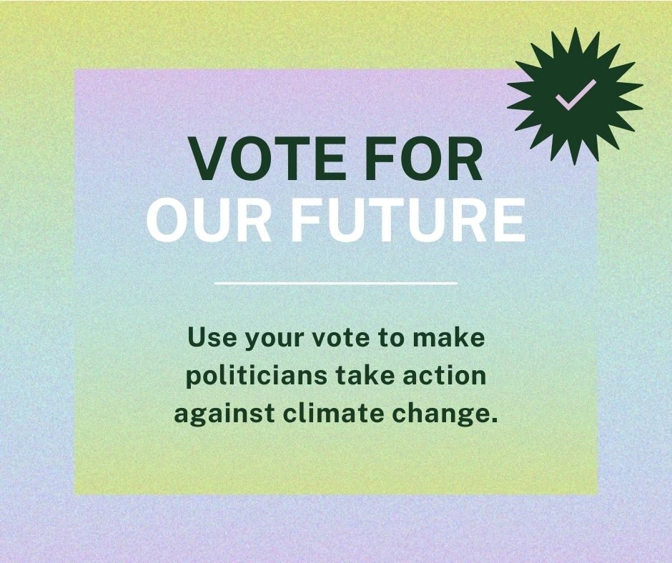
Printing Products For Political Campaigns

Running a Political Campaign? In this guide, you’ll learn about the best printing materials for successful political campaigns.

What are political materials?

Political materials are the tools used to promote a candidate or campaign. This can include signs, banners, flyers, and campaign literature. When planning a campaign, these items will help bring attention and support to your cause.

Why use political materials?

Printing products for campaigns create several benefits:       

  • Helps get out the vote for important election
  • Increases awareness of your platform and supporters
  • Reinforces key points about voting/election
  • Increases name recognition (turns voters into donors)
  • Builds momentum, especially if you have a strong volunteer force

How do I get started with printing the right products?

Start by assessing what materials are needed for your campaign. You might need some items immediately while others can be saved for the final weeks of the election.

This will depend on your budget and knowledge of when to distribute material in order to create the most impact.   

Once you know what is needed, it’s time to turn to reputable printing companies for help. They’ll work with you throughout the entire process to ensure that you receive quality products at affordable prices.

Political Signage:

The first step in planning effective political signage is making sure it reflects your values and those of the community as much as possible.

Voter turnout is typically low during local elections, so it’s important to reach a high number of people in order to effectively spread the word.

political campaigns

Placing signage at high-traffic areas is a good way to do this.

A few key things to remember when planning political signs include:

  • Be clear about your message.
  • Avoid shocking or questionable language.
  • Make sure all information (candidate name/party affiliation/etc.) on signage is correct
  • Always check with local laws before implementing design ideas and always choose quality materials.

Political Banner Printing:

Creating banners for an event or election is an excellent way to let voters know exactly what’s happening and where. Post office support is also extremely helpful when trying to make sure banners get the visibility they deserve.

Successful banner printing starts with creating a design that is eye-catching, yet reflects your campaign well. Avoid using bright colors; rather, choose simple options that will stand out amongst other signage but won’t overshadow it.

Effective banner printing continues with proper placement of your material.

A few key places include:

  • Bus stops
  • Parks
  • Post offices
  • Schools
  • Sports fields
  • Sports arenas
  • On streets
  • Near voting locations
  • Door-to-door canvasing events
  • Event venues

Not only are these places high traffic areas where a lot of people will be able to see your banner, but they also help get out the vote.

There are a variety of materials used in making banners for political events and campaigns.

The three most common include:

Plastic Vinyl Cloth

While plastic is more affordable, vinyl banners last longer and can withstand harsher weather conditions. Cloth is a good option when money isn’t an issue since it won’t rip or tear easily, even during adverse weather conditions.   

Political Campaign Literature:

Choosing the right material for printable campaign literature begins with choosing what you plan to use it for. If you’re handing out flyers at an event, choose a thicker paper that’s likely to stand up to wear-and-tear.

Stickers are also an excellent option for campaign literature; they’re easy to share and can go on anything from phones to helmets, depending on the size.

Depending on your budget, you may want to order material in bulk. This is especially true if you plan handing out leaflets via post office (the USPS now requires political campaigns to use pre-printed envelopes).

Quality printing companies will work with you throughout the process of creating campaign materials so that everything comes together at the right time.

Using Political Posters:

Printing posters for a political campaign is an excellent way to reach many people at once. Not only do they stand out due to their sheer size, but most communities hang them up outside of government buildings or community centers instead of on street lamps and other public property.

Political poster printing begins with creating an eye-catching design that represents your campaign well.

As with all campaigns, avoid using bright colors, instead going for simple options that will stand up against sunlight and weather conditions without looking outdated after a few days.

Keeping the time frame in mind is also key when designing a poster; it should be designed so that it doesn’t look out of date two weeks from now, even if you have to sacrifice some creativity along the way.

When it comes to political poster printing itself, there are many things to consider:

Material Thickness

Thicker paper is easier to hang outdoors and won’t rip or tear as easily when hung outdoors.

Multiple Sizes – You can order your material in multiple sizes depending on what you plan to do with it. For example, political posters are often created in both A1 and A0 printing sizes, while leaflets may only need to be ordered at a smaller size.

Printable Areas

Since the majority of political poster printing is done digitally, you’ll have more options when it comes to which parts of the image can actually be printed

Colors – CMYK or Pantone?

Whether or not you want your design colorized is up to you Size

How big do you want your posters?

They can range anywhere between 24 x 36 inches all the way up to 2 x 8 feet.

Political Campaign Postcard Printing:

Postcards are excellent for ensuring that no mailbox goes without political information during an election. They’re also good for handing out at events, when placed in a clear sleeve with other postcards.

Printing postcards is similar to printing posters; since they are printed digitally, you can choose which parts of the design are allowed to be printed. However, there are several differences between the two options:

Thickness

Postcards are typically thinner than posters so that they can easily fit into mailboxes.

Color vs Black-and-White – Postcard material will cost more if it’s colorized Printing

Sizes – While posters can be ordered in sizes up to 2 x 8 feet, postcards are usually only available in standard 6 x 4 inch sizes

Paper Weight Postcards tend to be made with lighter paper, which is more likely to curl when placed in a mailbox.

Printing Leaflets:

Leaflets are one of the most common forms of campaign literature in any election cycle. They’re also one of the cheapest options, so they’re popular among local campaigns without large budgets for printing materials.

When it comes to leaflets themselves, there are three different types that you can order from your printers:

Single-Sided – The majority of political leaflets are printed on single-sided paper

Double-Sided – A small number of leaflets use double-sided printing

Trifold – These are rarely used outside of religious communities, but may still find their way into politics if spread by churches and other religious organizations.

Sizes – Leaflet printing can produce leaflets in any of the standard sizes, including A5 (4.1 x 5.8 inches), A4 (8.3 x 11.7 inches) and A3 (11.7 x 16.5 inches).

Color vs Black-and-White

Leaflets are almost always printed in full color; however, they can be ordered in black-and-white if needed Printing Sizes – Most political leaflets are only available in standard sizes like 4 x 6 inches or 8 1/2 x 11 inches Material Thickness .

How much does political mail cost?

As mentioned above, the cost of political poster printing can vary significantly depending on which material you use and how many copies you need.

By far the most cost effective option for political poster printing is single-sided paper; however, this leads to a number of major issues:

The only way to fix them once torn is by taping or gluing them back together.

Neither of these options will look professional over time. You cannot hang them outdoors without risking damage or tearing.

Larger posters printed on lighter paper may require stapling to keep them up If hung outdoors, larger prints are likely to tear in high winds.

While double-sided posters address several of these issues, they also have their own problems:

They tend to curl when hung outdoors. Most double-sided printing is used with heavier paper, which can lead to tearing when mounted or handled improperly.

Quality Political Poster Prints Cost

The most expensive option for political poster printing tend to be leaflets printed on thick material with double-sided printing. While these are by far the sturdiest option available, they also come at a significantly higher cost than all other printing materials.

Since leaflets are most commonly given away by campaigners, this increases their chances of being discarded before your message can be read – especially when placed in trifold format.

Start Your Political Campaign With RushMyPrints Here!

corporate companies
Printing Guides

Printing materials for corporate companies

Own a corporation? Learn about the best printing materials for corporate companies to grow business.

To get started, lets cover the most impactful printing products used today:

  • Business Cards
  • Brochures
  • Postcard
  • Direct Mailers
  • Stickers
  • Labels
  • Letterhead or Envelopes

What makes Great Business Cards?

Business cards are fantastic for corporate companies because they are a marketing tool that can be brought to many events and passed out to prospects. The size, quality, and color play a big role in whether or not your business card will be kept.

1. Size:

Standard 2×3 inch cards are the most common for corporate companies because they can fit well into your wallet or purse. They can easily be kept in a drawer at your desk.

2. Quality:

A minimum of 10 pt (pounds) should be used for great looking and easy to hold business cards. Not only do you want the card to look good, but it is important that they can be held by people without bending easily. High quality printing paper will also help with printing and makes a huge difference.

3. Color:

Choose the appropriate color palette that works best for your business and brand personality. Think about the colors you have been using on any advertisements or marketing materials, these are usually great colors to pick from.

If you have been using orange all over your website, it is probably not a good idea to use orange for your business card since it might confuse potential clients if they see an orange card from someone else in their wallet.

How are brochures used to grow a big company?

A fleet of brochures created will help any size company grow because people will see your products and services on them again and again. Brochures are great for corporate companies to use in their lobbies or waiting rooms, take them with you to events, pass them out at the store or post office.

corporate companies

1. Size:

Businesses can utilize two kinds of brochures, a tri-fold design which is popular because it fits well into folders or pockets in notebooks or stacked together neatly on a counter top. A gate fold is also very common that opens up wider than standard letter size paper. Having multiple sizes allows companies to have marketing materials that are easy for customers to hold onto throughout the day .

2. Quality:

Brochures should be printed on glossy paper if they will be inside of a folder or pocket, if they will be outside in the hands of clients, choose matte paper.

3. Content:

The content is what makes a brochure stand out from the rest and should be designed in a way to help grow your company through educating people about your potential products or services. Make sure you have keywords written on each page that would connect with search engines when people look online for additional information.

What about using Postcards?

Postcards can be used as a marketing tool for any size business but work particularly well for large corporations because they can fit into mailboxes where standard envelopes do not go easily. Big companies have thousands of employees who could potentially hand out postcards to prospects throughout the day . Postcards are a great way to update people about changes in your company or upcoming events.

1. Size:

Size is important for any promotional materials, make sure that postcards can be held easily and do not rip when they are pulled from the mailbox by employees who will be giving them out. Standard size 4×6 inches work well because they can fit into envelopes without folding in half .

2. Quality & Content:

Similar to business cards, investors prefer 10 pt paper for postcards because they hold up better without bending in the hands of prospects throughout the day . A lot of companies use different printing processes such as spot UV coating to add a glossy shine or matte coating so it feels more like paper instead of slick plastic

Postcards should fit into the overall marketing plan and contain messaging that is consistent with other advertisements such as website, social media profiles and email campaigns.

Try to keep your postcard the same size, shape and color as any other materials you have created so they can easily be recognized as part of a larger campaign .

Think about ordering postcards with die-cuts or perforating lines so clients can easily quickly detach them from a book.

When should I use posters?

Corporate companies who want to grow business fast could benefit from printing posters because large amounts of them encourages employees to give them out at events, post office and schools.

There are several different types of posters that can be used to help any size business such as:

Billboard-style (28×40) which print well on a single sheet of paper or roll up to easily carry around without breaking

Campaign theme-style – these have pre-designed themes that correspond with each other or have one main image that ties into the overall message

Informational style – similar to campaign styles but focus more on individual sheets of content.

Posters can be used to speak out your products and services in a visual way that will be remembered by prospects.

They should contain keywords that people would search for online to find additional information about corporate companies such as phone number, social media profiles and website .

Posters work incredibly well for larger corporations because they can print multiple sheets of paper on one machine at the same time, quickly creating the amount needed without stopping overnight to finish them.

Using Direct Mailers to grow your company

Direct mailers are an excellent way to catalyze growth in any business. This is because an expertly designed direct mailer can look just like a real bill and get delivered right to the mailbox of every single person you do business with .

Even if people don’t open it, it still makes your company known since your name will appear on their statement. Some people will see your logo multiple times throughout the month and be compelled to learn more about what you do either online or in person .

Direct mailers come in several different forms such as:

Full color postcard which easily fit into any standard sized mailbox without folding typically contain catchy messaging that encourage prospects to take action

Each component should include logos, colors and fonts that match exactly with other marketing materials such as website and social media profiles so they can recognize it immediately when they see it.

Make sure the postcard is easy to read without feeling too busy, corporate companies can use big fonts and large images to grab the attention of prospects but should not focus so much on design elements that it looks unprofessional or cluttered

Order cards with gloss or matte finish because these two finishes are the most common. Clients will be able to easily grip each card without dropping them while giving them out across campus during an event .

Encourage employees to give high quantities of direct mailers away at schools, festivals, shows, conferences and networking events because they are very effective for any growing business need. Make sure your staff knows how important it is to take them anywhere where they may gain new clients.

How Stickers and Labels Help Businesses Scale

Stickers and labels are crucial to growing a business. Here’s why:

It makes it easier to share products because anyone can slap a sticker on a product and give it away across campus

Stickers and labels are cheap to buy in bulk so they can be used in several different types of marketing campaigns

Each component should include logos, colors and fonts that match exactly with other marketing materials such as website and social media profiles so they can recognize it immediately when they see it .

Encourage employees to attach stickers to any type of promotional products for clients at networking events or conferences so each client will remember your company’s name. Stickers would also work well attached to any product that needs labeling before being handed out during an event.

Labels are beneficial if you’re selling the same item over and over again. It is important to make sure the label fits securely onto the top of any product such as water bottles, pens and pencils, USB drives and power banks.

Demand for these materials should start low because not everyone needs them but continue slowly increasing as you grow your company .

Stickers and labels are key ingredients to helping clients find your company again when they need more products. So growing a business will be much easier if they can see your logo during several different types of events like:

Networking parties:

There are so many events every single day where corporate companies could set up a booth or table to hand out promotional items with their contact information on it. These forms of advertising work because prospects don’t typically attend networking parties to buy anything, they attend to meet new people and discover great opportunities.

Give away promotional items such as:

Your company’s stationery should include logos, colors and fonts that match exactly with other marketing materials such as website and social media profiles so they can recognize it immediately when they see it .

Letterheads and Envelopes as Printing Products? Yep!

Letterheads are a phenomenal way to grow your business by expanding your marketing campaign with direct mail campaigns.

Pertaining to corporate company print, letterheads are envelopes that feature codes like “re:” or “cc:” which indicate the beginning of a sentence and who it’s meant for .

They’re typically made up of three parts:

The biggest benefit of using letterhead is that people open letters more than they open email so you’ll probably get asked what the meeting is about if prospects receive one in their mailbox. And now they know exactly where to find you when they decide to visit your office.

Envelopes as Printing Products

Envelopes are an excellent way for clients to keep touch with your company even when they’re on-the-go.

What makes a good envelope for a business?

It should feature relevant logos, colors and fonts that match exactly with other marketing materials such as website and social media profiles so they can recognize it immediately when they see it .

Stickers are inexpensive to buy in bulk so you can use them throughout several different types of marketing campaigns.

You shouldn’t even need to design one if the envelopes already have an address on them because you could just attach a sticker with your logo onto it to make sure clients will remember where to find you when they need more products.

Own a Corporation? Click Here To Order Printing Products!

using posters to pitch
Printing Guides

Using Posters to Pitch Your Idea

Planning on using posters to pitch your next business idea? Here’s a guide for what to include and how to design the perfect wide format poster presentation.

In order to make the most impact, be sure to include all the key details and design the poster in an attractive and professional manner.

The use of posters to pitch your idea is a great way to have an attractive and professional presentation. However, there are some key details you should include in order to make the most impact for your audience.

The following guide will help you decide what important information needs to be included on the poster, as well as how it should be designed in order for it to communicate effectively with its target audience.

Picking the Right Poster Material

Picking the right poster material is an important part of creating a successful wide format poster presentation. The type of material you choose will determine the durability and appearance of your poster.

There are a few different types of materials you can use for your poster:

  • Paper
  • Poster Board
  • Film
  • Mat Board

Paper

This is the most common type of poster material, and it’s available in a variety of weights and colors. Paper is lightweight and easy to transport, but it can be prone to tearing and creasing.

Pro’s using paper as poster material:

It’s inexpensive and can be purchased in bulk

It comes in a variety of weights and colors

Con’s:

The is prone to tearing and creasing.

Poster Board

Poster board is made from cardboard and is available in different thicknesses. It’s heavier than paper, making it more durable but also more difficult to transport.

using posters to pitch

Pro’s using poster board as poster material:

It’s more durable than paper

It comes in a variety of weights and colors

Con’s:

It can be difficult to transport. It doesn’t roll up easily, so it must be stored flat, which takes up more space. Additionally, poster board is thicker than paper, so it may not fit into standing displays.

Film

Film is a durable material that can be printed on both sides. However, because it is a thicker material, it can be difficult to transport and may require a laminator for storage.

Pro’s of using film material:

It’s more durable than paper or poster board

It can be printed on both sides, making it versatile

Con’s of using film material:

It can be difficult to transport due to its thicker size. Additionally, if you do not have access to a laminator for storage, the posters must then store flat which takes up more space.

Mat Board

Mat board is made from a variety of different materials, such as aluminum and cotton. It’s heavier than film or paper, but it can be designed to have a sleek appearance without being too thick.

Pro’s using mat board as a poster material:

It’s durable and easy to transport

The sleek appearance means it doesn’t take up much space when stored

Con’s of using mat board as a poster material:

It can be expensive

Using the Right Format

Once you’ve decided on what type of poster material to use, the next step is choosing the right size and format for your wide format poster presentation.

There are a variety of different formats available, each with their own advantages.

You can choose to do an 8.5×11 or 11×17 version or you can go larger and create a 24×36 poster presentation.

8.5 x 11 Poster Presentation

The advantage of using 8.5×11 is that it is small enough to transport, but still large enough that the writing is clearly visible.

The disadvantage of using 8.5×11 is that it cannot be displayed in a standing display without blocking other walkways, and it can easily be lost out of sight in a larger room.

11 x 17 Poster Presentation

By creating an 11×17 poster presentation, you can display your poster in a standing frame. This is a good option if you have enough people to staff the booth and keep watch on your poster presentation.

The disadvantage of using 11×17 is that it is heavy and difficult to transport.

24 x 36 Poster Presentation

Creating a 24×36 poster presentation is a good option if you have enough people to help transport and staff the presentation. It’s also a good option if you’re worried about your poster getting lost out of sight, as it can be displayed in a large room.

The disadvantages of using 24×36 are that it takes up more space when stored and is difficult to transport without a truck. It may also be difficult to print if you don’t have a large printer.

What to Include on Your Poster

When creating a wide format poster presentation, it’s important to include all the key details in order to make the most impact with your audience. The following information should be included on your poster:

1. Your name and contact information

2. The title of your presentation

3. Who your target audience is

4. What your idea is and what problem it solves

5. The benefits of your idea

6. How much it will cost to implement your idea

7. A timeline for implementation

8. Your biography or a brief overview of your experience

9. Any relevant images or graphics

Poster design tips

In order to create a successful wide format poster presentation, keep the following tips in mind:

Keep it simple!

Keep your poster simple and easy to read so that your audience doesn’t have to squint or strain to see the information. Focus on one idea per poster, and don’t overwhelm your audience with too much information.

Use large, legible type

When designing your poster, use a font that is easy to read. A good rule of thumb is to make the title of your presentation at least two times larger than the rest of the text.

Use color!

Adding color can help emphasize important parts of your design and make it more dynamic. You can also use color to attract the attention of your audience.

Use graphics!

Graphics can be an effective way of communicating ideas visually, so consider using them in place of traditional text. Use graphs and charts to show necessary information, like how your product affects other products or how much money your idea will cost.

Include a QR code!

A QR code is a great way to enhance the functionality of your poster and allow viewers to easily access online content with their phones.

This can serve as a way for them to learn more about your idea or read reviews from users if they’re interested in learning more.

Build your perfect poster with RushMyPrints Here!

perfect wine label
Printing Guides

How to design the perfect wine label

ryWine labels come in all shapes and sizes, and can be as simple or as complex as you want them to be. But there are a few things that every great wine label should have.

In this guide we’re going to make sure you understand the following core concepts before ordering or requesting a quote from us. This will help you make the most informed decision!

  • How to design the perfect wine label
  • The dos and don’ts of wine label design
  • How to choose the right fonts for your wine label
  • The importance of color in wine label design

Here’s a look at some of the most important design elements that will make your wine label stand out from the competition.

How to design the perfect wine label

The perfect winery label design requires a lot of thought, planning and preparation. It’s not just about slapping a label on a bottle and calling it a day!

The perfect wine label design isn’t too crowded and displays your brand name. At the very least , each wine label should contain the following:

The name of your winery or vineyard

The name of the wine (including vintage)

Your branding logo (in some cases, the branding logo may also be used as a secondary design element)

A high-quality product is more likely to attract customers, so it’s in your best interest to have the highest-quality printed wine labels possible.

Cheap printed wine labels can be found on many sites online, but these are often lower quality with thinner paper and cheaper ink.

Dos and don’ts of wine label design

When it comes to wine label design, there are a few dos and don’ts that you should keep in mind. Here are a few tips to get you started:

perfect wine label

Do:

– Make sure your wine label is easy to read. Use fonts that are easy to read and understand, and make sure the text is large enough to be easily legible.

– Keep your design simple. Don’t try to cram too much information onto your wine labels – less is more when it comes to wine label design.

– Use high-quality graphics and images. Cheap, low-quality graphics will only make your wine labels look cheap and unprofessional.

Don’t:

– Use tiny fonts. Not only will tiny fonts make your label hard to read, but they won’t be visible from far away.

– Use too many fonts. Similar to the point above, don’t make your wine labels look cluttered by using too many fonts. This is often referred to as “font overkill”.

– Include text that doesn’t make sense on a wine label. If you’re going to include text on your labels, make sure that the message is crystal clear.

How to choose the right fonts for your wine label

It’s incredibly important that a wine label contains high-quality graphics and easy-to-read fonts. When it comes to choosing a font, here are a few things you should consider:

– Make sure your fonts are legible. This means that the font should be easy to read, even for people with less than perfect eyesight or who are color blind.

– Use different types of lettering to clearly indicate different sections of information on your wine labels. For example, use a bolder type of lettering for section headings, and a lighter type of lettering for the body text.

– Use fonts that will look good when printed on glossy and matte wine labels. This is important to ensure your final product has a high-quality finished appearance.

The importance of color in wine label design

Color plays an integral role in every aspect of design, including wine label design.

Here are some tips for using color in your wine labels:

Use official branding colors. Make sure the colors you use on your wine labels match with the branding on your wine bottles and other promotional materials.

Use contrasting colors. This will ensure that your text is easy to read, even from a distance!

Use colors that complement the wines you’re promoting. For example, if you’re selling wines with a dark and rich color profile, use darker and more saturated colors on your wine labels.

Some famously well designed wine labels

These companies really nailed it when it comes to wine label design done well:

– Eva Glas Wine Labels

– Le Petit Ballon wine labels

– Benvolio Prosecco

– A to Z Wineworks

– Vespa Vines

Design your perfect wine label with RushMyPrints By Requesting a Quote Here!

product brochures
Printing Guides

How to Design Effective and Eye-Catching Product Brochures

Eye-Catching Product Brochures

Here’s How to Design an Effective and Eye-Catching Product Brochure!

It is important for businesses to have attractive and well-designed product brochures. These brochures should not only be visually appealing, but also contain all the necessary information about the products that are being sold.

They should also be easy to read and understand, and should highlight the unique selling points of the products.

Tips for designing a brochure that will catch the eye of potential customers

When it comes to designing an effective and eye-catching product brochure, there are a few key things to keep in mind.

The most important thing is to make sure that the brochure is visually appealing, and that all the information about the products being sold is included.

product brochures

It should also be easy to read and understand, and should highlight the unique selling points of the products.

10 tips for designing a brochure that will catch the eye of potential customers:

1. Use attractive visuals to draw attention to the brochure.

2. Make sure all the information is easy to read and understand.

3. Highlight the unique selling points of the products.

4. Use creative fonts and colors to draw attention.

5. Make sure the brochure is fun, engaging, and eye-catching.

6. Ensure that any words used are short and easy to understand.

7. Proofread what you have written before sending it for printing or publishing online.

8 .Don’t be afraid to ask someone else for their input and ideas.

9. Make sure all details are correct before you publish anything.

10. Remember that creativity is like a muscle; it must be exercised regularly to stay in shape!

Things not to do when putting together your brochure

When creating a product brochure, there are a few things you should avoid doing. Some of the most common mistakes include:

– Including too much information – This can overwhelm potential customers and cause them to lose interest.

– Writing in a formal or stiff tone – People are more likely to be drawn to brochures that are fun and engaging.

– Being overly sales-y – Customers will be turned off if it feels like you are trying to hard to sell them something.

– Including too many graphics or images – This can make the brochure difficult to read and understand.

– Making the font too small – This can also make it difficult for people to read the information.

Keeping all these tips and tricks in mind will help you to create a product brochure that is eye-catching, effective, and informative.

If you follow our advice carefully, there’s no reason why your next product brochure can’t be an enormous success!

Product Brochures Are a Business Weapon!

Product Brochures are often used to display information about various  types of products.

The information in a brochure can include things such as what the product is, where it was manufactured, the materials used to make it, and much more.

Product Brochures are often given out at events or sent through mail.

A Product Brochure template can easily be found online for various types of businesses and applications. Some examples would be business cards, stationery, and advertisement material.

The Product Brochure template can easily be edited using popular word processing software such as Microsoft Word.

It is important to use a talented graphic designer when it comes to designing something like a Product Brochure so that the finished product will attract potential buyers.

What typeface should be used on the cover page

When it comes to choosing a typeface for your product brochure cover page, it is important to pick something that is easy to read and catches the eye.

Some of the most popular typefaces for this purpose include Arial, Helvetica, Times New Roman, and Verdana. You may also want to consider using a creative font for added visual appeal.

What kind of paper should be used

When designing a product brochure, you will need to choose the type of paper that is going to be used.

This decision is based on what the brochure will be used for and where it will end up after being read.

Some popular choices include matte or glossy photo paper, high quality gloss paper, and matte photo paper.

How to design a product brochure

When designing a Product Brochure, you want to make sure that it is eye-catching and easily understandable.

Some of the most important steps include the following:

– Choosing an attractive typeface that will catch people’s attention

– Using creative and interesting fonts is a great way to add some visual appeal. It’s important to avoid using any type of font that is difficult to read or understand.

– Using high quality images or graphics

– This will add another layer of interest and make your brochure stand out from the crowd.

– Keeping it simple and easy to follow

– Customers won’t be interested in purchasing your product if they can’t figure out what it is, how much it costs, and where they can get their hands on one!

– Being honest and straightforward about who you are and what you do

– People don’t want to feel like they’re being tricked into buying something so it’s important not to hide anything from them. They deserve honest, reliable information so that they can make an informed decision without feeling like they’ve been misled.

Making it easy to contact you!

This means including your name, address, phone number, email address, and website throughout the brochure in an obvious manner.

These tips will help you to create a product brochure that is attractive and well-designed. The result will be something that customers are drawn to and will be eager to read!

How important is design in marketing?

The layout of a product brochure is very important because it helps attract potential buyers.

It sends out messages about what the company’s values are and how trustworthy they are as a brand or service provider.

The design of a Product Brochure should fit the style of the company for an overall cohesive look.

Poor design can give off a very unprofessional impression, which is bad news if you’re trying to attract new customers.

Good design helps companies stand out from the crowd and gives people confidence in what they are purchasing.

It’s important to remember that even if your product or service is top-notch, poor presentation could result in lost sales!

What makes good brochure design?

There are several things that make up an effective Product Brochure including:

– The text should be easy to read and understand

– It’s important not to overcomplicate things by using cluttered fonts or having huge blocks of content with no break between paragraphs.

– Images should be large enough to make the product stand out

– Too much text can be a turn-off for potential buyers so it’s important not to include too much. – Photos and graphics should complement one another and add interest

– If you’re going to use graphs or diagrams, they should be clear and easy to understand

What is a good length for a product brochure?

A Product Brochure can vary in size depending on what you are using it for. Some examples of the most common lengths include:

– Half page (4 x 6 inches)

– 4 pages (8 x 11 inches)

– 8 pages (11 x 17 inches)

At what point does your design resemble an ad?

There is no hard and fast rule about this as it will depend on the product and what you’re selling.

However, people who see your Product Brochure may think that they are looking at an ad for a particular brand or service so it’s important to keep the design consistent with whatever marketing material you have created already.

How can I use my Product Brochure?

A Product Brochure is a great way to advertise a new product or service to potential customers. It can also be used as a promotional tool for special offers, discounts, and sales.

You might choose to give out free brochures along with your business cards at trade shows or other events where people from your target audience may be present.

They can also serve as a useful reference for customers who may already be familiar with your business and want to learn more about your latest products and services.

You should include the brochures in promotional packages that you send out to people such as schools or retail stores.

It’s important to design your Product Brochure with customer needs in mind because it will help them decide whether they’re interested in buying what you have to offer or not.

Request a Quote For your Next Perfect Product Brochure Here!

In this printing guide
Printing Guides

Print advertising for law firms

Print advertising for law firms

In this printing guide, learn about the best products and strategies on print advertising for law firms.

With the introduction of online advertisements, print advertising has lost its popularity in the last few decades.

With the advent of search engines and social media platforms, people tend to prefer an ad that would be immediately visible rather than waiting for a long time until they open their mailboxes or check their snail mails.

However, just because it has not been popularized recently doesn’t mean you shouldn’t consider using it at all. There are still certain instances when print ads could come in handy.

Print advertising examples:

Law firms, especially those who are well-known in their respective industries, could benefit from print advertising because it is much more affordable than other forms of advertisement that would also be much more to maintain day after day.

If you want to start your own print ads but do not know what product to use or how to design it, there are several companies out there who can help you out with your advertisement needs.

For instance, they offer different sizes of advertisement posters depending on your budget and available space to place them in.

Types of printing products

These come in either matte or glossy finish; both providing great colors and photo prints respectively.

Clear coat laminated posters even provide extra protection against spills and dirt! So if you want your posters to stay looking fresh and new for a longer period of time, this is definitely the product you should choose.

What is clear coat laminate?

Clear coat laminate is protection for your print ads that are supposed to stay outdoors for a longer period of time.

Once placed outside, they will be exposed to the elements such as dust and dirt so if you want them to still look clean and new after months or even years, clear coat lamination is the solution!

All these products are made with high quality materials that can last up to 50 years indoors and 100 years outdoors!

What law firms should focus on other than design?

When it comes down to printing products, there are particular things you shouldn’t overlook. For one, make sure you use high resolution images since posters are printed in larger prints compared to flyers.

Images would usually appear grainy once it is so using lower resolution photos could make your design look bad.

Another thing you should not forget is your logo.

Make sure to include it on the poster since this is how people will identify you, especially if they are used to seeing your brand in other media platforms like television advertisements, billboards and radio ads.

Make sure that your text content provides vital information about what your law firm can do for its clients, e.g., free consultations or even free initial legal fees!

Having these contents are significant because it would motivate potential clients to contact you for help instead of making them choose another lawyer who offers similar services.

Other than designing a poster with high quality images and including informative text content, never forget to distribute printed materials in

The best printing products – use them all!

Aside from different poster sizes and finishes, there are also other material such as business cards , flyers , brochures , booklets, folders and even calendars that can be produced by these companies.

Each comes with its own advantages and disadvantages so choosing the best one could mean the difference between success and failure in promoting your brand name or law firm.

For instance, while business cards could easily fit in pockets and wallets, they only have limited space with small font size to write on them unlike flyers which allow more space but might not be easy to hold when browsing through them due to their flimsy weight that cannot possibly fit in a single hand.

In order to make the best out of your investment, it would be advisable to consult with an advertising or marketing consultant like RushMyPrints, who can provide you information about the different products and their costs along with advice on where to place these printed ads in.

This way, you could accomplish more for a better cost while having the chance to advertise your firm’s brand name without going too far over your budget

Request a quote for you Law Firm Here!

online shop
Printing Guides

Print Products for Your Online Shop

Print Materials You Need for Your Online Shop

In this printing guide, learn about the print materials you must have for your online shop.

Table of contents:

  • What are print marketing materials?
  • What are the types of printed materials?
  • What kind of prints does an online shop need?
  • What are the best stickers for an online shop?
  • What are the best package prints for an online shop?
  • What makes a good label to print for your products

What are print marketing materials?

Print marketing materials are documents that print the image of your business. Print materials such as leaflets, banners and flyers can be distributed in several ways:

  • Through the mail
  • Direct distribution to an audience
  • Events or trade shows
  • Display boards in shopping malls.

What are the types of printed materials?

Let’s get back to what you need for your online shop.

There are three main types of imaging materials necessary for any kind of advertising campaign:

  • Brochures
  • Flyers
  • Catalogs
  • Package Prints
  • Labels
  • Stickers

Each printing type has its own advantages and disadvantages. Consider the most common cases below when choosing which type is best suited for your online business needs.

For example, if you need more information about a particular product, a brochure is what you need. On the other hand, if you want to highlight all your products at once, a catalog is the best choice.

Try to read more about each printing method below to see which one would be the most suitable for your business.    

Printing Brochures:

Brochures are perfect when you have more detailed information that needs to be shared with customers. This print marketing material can contain detailed descriptions of products or services as well as special offers and promotions.

They are a great way of informing potential customers about important information they might not know about your company and its awesome products/services

Utilizing Flyers:

Flyers are small printed materials often used by businesses to advertise their latest deals or discounts on specific products.

This type of print marketing material is meant to be delivered face-to-face with customers by a company representative, usually in a stack placed on top of goods or handed out directly to people walking past the store front.

Flyers are not expensive and can be bought from printing companies in bulk at reasonable prices, making them perfect when you want something quick and affordable that doesn’t require too much attention from your business.

Printing Catalogs:

A catalog is a collection of leaflets aimed at promoting a product line. A printed catalog has a greater value than online catalogs because it can present more information about your products in detail. Therefore, it increases the brand’s credibility through improved customer service and higher quality materials.

Catalogs are great for when you have a range of products. They are also useful when your customers need more information such as product specifications and prices before they make a purchase.  

Labels:

Labels can be printed with barcodes, QR codes or UPC labels to improve sales and give customers easy access to information about the company that made the product. It is important that the label can be read clearly and quickly by customers to avoid loss in sales and help the firm get feedback from buyers regarding their experience with different products and services.

Stickers:

No matter how small or cheap these materials seem, stickers should not be underestimated.

As long as sticker materials follow proper design layouts and guidelines, it can be a huge help in getting your business noticed and attracting more customers.

So, if you run an online store then you should know that these print materials are essential for the promotion of your business. If printing isn’t your strength, there are companies out there who can take care of it so you don’t have to fret. 

So what are you waiting for?

Get down to creating amazing marketing materials now Here!

attending a conference in las vegas
Printing GuidesUncategorized

Attending a Conference in Las Vegas

Tips for Attending a Conference in Las Vegas

In this printing guide you’ll learn about attending a conference in Las Vegas and how to succeed by earning more business with printing products like business cards, posters, and more.

Let’s jump into it!

Important sections in this guide to pay attention to:

  • How do I get the most out of attending a conference?
  • How do you prepare for a conference?
  • How much is a convention space in Las Vegas?
  • How do I promote my business in a conference?

How do I get the most out of attending a conference?

Attending a conference is an opportunity to engage with existing clients and get new leads for your printing business.

Because of the large number of people attending these conventions, it’s possible to meet hundreds of potential prospects in just a few days.

But not all conferences are created equal. There are some key elements to consider when you’re preparing for an event:

What kind of audience will be at the conference? Look at the list of exhibitors and sponsors and make sure that they fit into your ideal prospect profile .

If they don’t, there might not be much point in going.

Are there specific seminars or workshops ?

Sign up for anything that interests you and seems like it could add value to your business (or increase sales). It’s pretty common for seminars and workshops to be free, so there’s no reason not to add them to the schedule.

Is this a good time of year for attending?

Depending on your business model and where you operate, what season it is could drastically affect how busy you are. If you’re off-season in winter and there’s a big conference in Las Vegas during that same time, it might be difficult getting reservations and flights.

What is the cost of attending?

If the registration fee seems out of reach or you can’t make up the cost easily by selling products or services at the show, skip it. You don’t want to go into debt spending money on something that won’t return value (in terms of increased sales) quickly enough.

How do I prepare for a conference?

There are many ways to prepare before you go into an event or conference, most of which can be used no matter what size the convention is. Here are some tips:

Make sure your website is up-to-date . A stale website with old information doesn’t reflect well on the type of business you run.

Make sure your social media profiles are filled out completely and regularly updated. You never know who might find you through one of these channels, so it’s important that they’re active at all times!

If you have any physical products to sell, now is the time to develop your sales pitch!

How much is a convention space in Las Vegas?

A convention space in Las Vegas is going to be more expensive than a smaller space, that’s just the nature of the beast. Figure on spending at least $1 per square foot for a decent sized area if you’re looking for something in between 100 and 300 square feet. If you have more room, this price will go down proportionally.

For example, if you need an 800 square foot booth, expect to pay no less than $800. This is all up to negotiation really though so don’t take these numbers as hard facts!

How do I promote my business in a conference?

There are many ways to market your company when you attend a convention or trade show. Many people focus exclusively on print products but neglect digital strategies with their online presence , which is a huge mistake. Here are some ideas on how to promote your business:

Send a promotion immediately before the event starts

This gives customers something to look forward to when they get their schedule in advance, and it also serves as a gentle reminder before you’re out of sight!

A postcard with information about your company is great for showing sales reps what you have to offer.

If you’re given literature or other items in print, make sure that they contain the words “Live Marketing” somewhere. If not, don’t bother handing them out because no one will know what it means!

Bring promotional banners , balloons , and signs .

Use social media channels like Facebook, Instagram , Pinterest , and LinkedIn to spread the word.

Use newsletters to announce that you’re attending.

Give out business cards

Handing these out is an excellent way of networking, getting your name out there, and establishing yourself as a leader in your industry. This also works well if your business is featured at the show in some way.

The majority of people who attend conferences are serious about marketing products or services, so they’ll be willing to hire you on the spot! If someone doesn’t need anything immediately, make sure not to lose touch with them completely – follow up afterwards with potential leads before it’s too late!

How do I promote my business while at a conference?

If there’s one thing that’s universal about trade shows, conventions , and other events like these, it’s that everyone is extremely busy.

They’re running around back and forth trying to accomplish as much as possible before the conference ends, not to mention they’re already exhausted because of all the physical activity!

This means you’ll need to aggressively market yourself without seeming too pushy or sales-oriented. Here are some tips on how to do this successfully:

Don’t hog people’s time

If anyone asks what you do or where your business is located , be honest about the fact that you’re just beginning and haven’t gotten started yet. This can be attractive for customers who prefer fresh faces rather than established companies that offer tired ideas at higher prices.

Remember names

One of the best ways to stand out from other vendors is to remember people’s names. This way they’ll feel valued, important , and it will help you to really connect with them so the relationship doesn’t die off after the conference ends!

Don’t ask customers what they’re looking for while they’re consulting with other vendors . If they approach you, go ahead and start your sales pitch but let them cut in if that’s what they want.

Get the best printing products for your next Conference In Las Vegas Here!

12